
Papp Domonkos
Brand identity and visual design
Updated: 9 October 2026
An identity works when you can use it consistently across your website and social posts. I bring colour, typography and imagery together to make your brand recognisable.
A new direction or an existing identity
We can build on your current logo and materials or explore a new visual direction together. We first clarify what your brand should communicate, who it is for and where the identity needs to work.
Colour and typography as a system
Backgrounds, text, highlights and buttons need to work together. Typography and sizing establish a clear content hierarchy. On a website, readability and mobile use are central considerations.
Logos alongside photography
I leave appropriate clear space around the logo and use variants suited to light or dark backgrounds. When placing images, I keep faces, important objects and text clear of inappropriate crops and graphic overlays.
Possible deliverables
Depending on scope: colour and type systems, graphic elements, post templates, a visual direction for the website and usage guidance. Logo creation or revision is a separately defined task. File formats and usage rights are agreed in advance.
DOMAFACTORY as a practical example
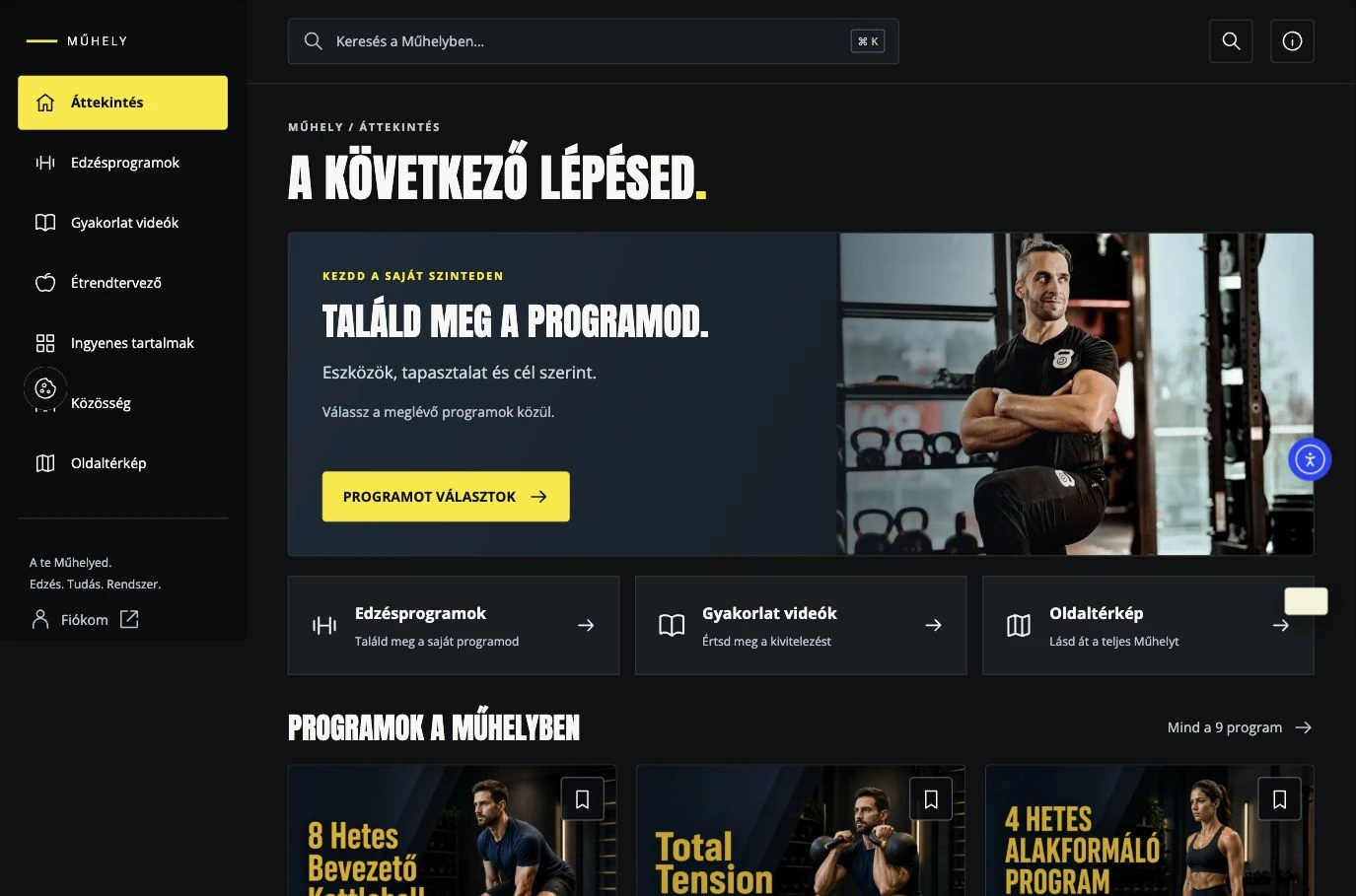
DOMAFACTORY and this personal website show how an accent colour, distinctive display type and readable body text can form a coherent system. The design works across light and graphite surfaces, photographs and application interfaces.
What helps at the first discussion?
A brief introduction to your brand, existing logos, previous materials and a few visual references. Explain where you plan to use the identity. These needs shape the direction rather than an isolated choice of colour or typeface.